Kissflow’s charts were slow, static, and frustrating. We redesigned them to be 60% faster, interactive, and AI-ready helping users make decisions faster and setting the stage for automated insights.

Overview
Team
Product Designer
Product Manager
Developer
Timeline
Aug 2024
In Development
Category
Web, Mobile
Line of Business
B2B SaaS
Project Overview
The chart redesign was initiated based on customer feedback from the pivot table redesign project. Users expressed frustration with similar issues in the charting tool, such as performance problems, limited customization, and poor usability. This led us to expand our focus to address these pain points in the charting system.
Problem
Why is it required & why now ?
You are in the middle of making a critical decision. You open your dashboard, expecting quick insights.
Instead, you stare at a loading screen.
10 seconds pass. Still waiting.
By the time the chart loads, you’ve lost momentum—and maybe, you’ve already moved to another tool.
This was the reality for Kissflow’s users.
Our users were losing trust with every slow-loading chart, causing them to abandon critical insights mid-flow. Some users started to consider alternatives due to chart limitations. To retain them promised to provide a better experience and address these challenges.
Unreliable Charts
Slow, outdated and suffered from sync issues, frustrating users and delaying decisions.
Customer Dissatisfaction
Over 30% of enterprise users reported dissatisfaction over public forms and raised bugs.
Competitive Pressure
Competitors like Microsoft and Airtable offered advanced features and raised user expectations.
This project was not only crucial for enhancing user experience but also pivotal for the future vision of Kissflow that is to empower Kissflow with AI capabilities.
Challenges customers faced
Performance Issues
Screen freezes when working with the larger data.
*Playable GIF image
GIF
Research & Finding
Understanding the Problem
Before making a single design decision, we aimed to gain a comprehensive understanding of the pain points and unmet needs of Kissflow’s users. To gain valuable insights, we conducted three key UX activities.
Uncovering the Pain Points
Analysing Competitors
To ensure our redesign aligned with industry standards, I conducted a competitor analysis, focusing on key features offered by top platforms like Google Data Studio, Chargebee, Freshdesk, Zoho, Posthog, Monday.com, Amplitude, HubSpot, ClickUp, Plausible Analytics, Asana, Glide and others.
Key Takeaways
After listening to real users, combing through feedback, and benchmarking against competitors, it was clear we had to rebuild the core of our analytics. So we planned to tackle this by working on the foundations by focusing on the key area.
Performance & Scalability – Charts had to be faster and more responsive.
Interactivity – Users needed sorting, filtering, and drill-downs to explore data.
Customization – Charts had to align with brand aesthetics for enterprise users.
Advanced Analytics – Users expected AI-powered insights and automation.
Ideate
Expected goals
Before moving forward, we sat down with key stakeholders to discuss our findings and align on priorities. From these discussions, we shaped clear business and design goals.
Business Goals
Customer Retention and Engagement
Increase Report Adoption
Competitive Edge
Design Goals
Enhance Performance & Scalability
Improve User Experience
Design
Phase 1: Fixing problems
We had to fix the problems first, and make charts fast, scalable, and interactive. Then, we could rethink analytics entirely. Users weren’t asking for fancy features. They just wanted the basics to work.
So that’s where we started.
GIF
Efficient Data Handling
For larger chart data, we used a zoom slider to load visible data, loading the rest later.
Displayed skeleton placeholders to give users a sense of progress and reduce perceived load time.
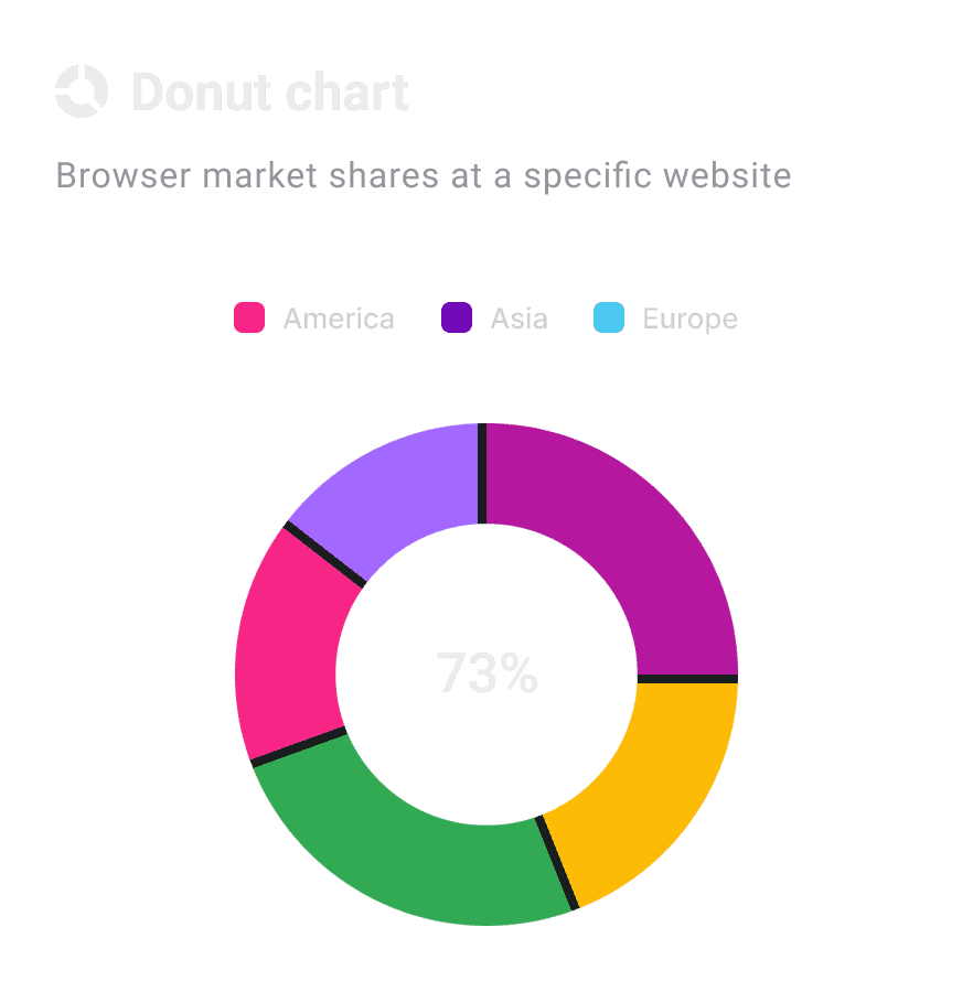
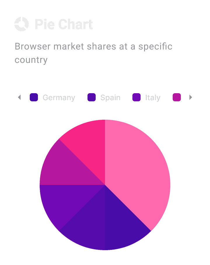
Customization
Gave users the power to personalize charts with colors, fonts, and layouts that align their brand.
The video features how a chart has been customized based on the need.
GIF
Design
Phase 2: Building Foundation
By fixing the problems and proving the needed features the next step was a complete visual and functional overhaul, a true transformation of the reporting UI. We redesigned the charts to make modern, clean, usable and brand-aligned. We created consistent user interactions and integrated the charts into our design system for scalability.
Redesign Focus Areas
Visuals
Usability
Interactions & Transitions
Accessibility


Comparison of Previous vs Improved Dashboard
Design system & Guidelines
After the redesign, I introduced guidelines to keep product consistent. These guidelines covered everything from visual design to interactions, helping maintain a cohesive user experience. Additionally, I integrated the new charts into Kissflow’s dev and design systems and built reusable components making it easy for everyone to adopt and maintain consistency and scalability.
Design
Phase 3: Advanced Analytics
At this point, we had fixed performance and redesigned the experience.
But we weren’t stopping there.
💡What if, instead of clicking through filters, users could just ask:
"Show me Q4 sales trends."—and AI instantly generates a chart?
💡 What if reports weren’t just static visuals, but AI-powered tools that highlight insights before the user even asks?
To achieve this we have further planned to power Kissflow analytics with AI as a support tool with features like Natural language queries, Predictive analytics and Automated insights.
But… Kisflow had other plans
Just as we were preparing for AI-first analytics, Kissflow made a strategic shift.
Instead of just improving analytics, the company was transitioning into a full-fledged AI-first low-code platform.
Looking Ahead
The New Vision: Kissflow AI-First Analytics
This stratergic change has given more room for innovations, so currently I have been working on few concepts to provide AI first analytics.
Concepts trying out
Natural Language Queries
AI-Generated Charts
Predictive Analytics
Automated Insights
"The next phase of this redesign is still under development and cannot be disclosed publicly at this stage. However, if you're interested in learning more about my experience, feel free to reach out!"
Impact
Let's talk impact
The chart redesign wasn’t just about improving aesthetics—it enhanced performance, increased adoption, and set the foundation for AI-powered analytics.
Improved Performance
Average chart load times reduced by 60% (from 10 seconds to 4 seconds).
Feature Adoption
Sorting & filtering adoption increased by 50%.
30% more users actively engaging with drill-down features.
Reduced Bugs & Retained Customers
Resolved 85% of critical charting bugs reported by enterprise users.
Customer retention improved as users stopped exporting data to external tools.
Business Growth & Foundation for AI
New customers signed up by seeing the improved design.
AI-powered insights are now possible due to a stable reporting foundation.
