Kissflow’s pivot tables frustrated users with confusion and abandonment with 68% user dropoff. We simplified and guided the experience, helping users get insights with ease.
Overview
Team
Product Designer
Product Manager
Developer
Timeline
Feb - Mar 2023
Shipped
Category
Web
Line of business
B2B SaaS
Project Overview
The Pivot Table Redesign was initiated after a drop in usage was identified through our data. Users found the existing Pivot Table difficult to navigate and felt it lacked essential features. Feedback indicated that the tool was no longer meeting their expectations, falling short of modern standards and missing basic functionalities typically expected in a pivot table.
Introduction
How it started?
When PM & I were looking at the analytics usage data we noticed an unusual trend, there was a 68% drop in completion rate of pivot table report creation, users were starting pivot table creation but abandoning it midway.
To understand better we watched recorded session in PostHog, we saw users started creating report, clicking around, hesitating, and eventually leaving without saving their reports. Many simply gave up and started to export data.
That's when we knew something was off and we need to address the issue. This project was crucial for enhancing user experience and increasing the completion rate.
Problems
Why Users Avoided Pivot Tables?
We started by digging into user complaints, support tickets, and session recordings. Then, we conducted user interviews, surveys, and competitor analysis to uncover why users avoided our pivot tables.
We uncovered three major issues that made pivot tables intimidating and hard to use:
Complex to Understand
Users weren’t sure where to start or what each option did. Even after creating a pivot table, it was complex to extract data.
Usability Challenges
Poor readability, weak hierarchy, and a rigid layout made data interpretation difficult, especially on smaller screens.
Functional Limitations
No sorting, filtering, resizing, heatmaps, drill-down, or basic customization, making it hard for users to interact with data effectively.
Problem
Challenges customers faced
Let's have a look at the challenges in the pivot table to understand what users went through when using pivot table.


Research & Finding
Understanding the Problem
To uncover the core problem of users quitting the pivot table report, we conducted user interviews, surveys, and competitor analysis. we aimed to gain a comprehensive understanding of the pain points and unmet needs of Kissflow’s users.
User Research Findings
We interviewed 10 users (4 analysts, 6 business users) and surveyed 50+ respondents.
Key Takeaways
Users struggled to complete reports → They abandoned the creation process midway due to confusion and a lack of clear guidance.
Unclear configuration process → Users didn’t understand what data to place where, causing hesitation and incomplete reports.
Hard to read reports → Even when reports were generated, the lack of hierarchy and structure made data interpretation challenging.
Mismatch with user expectations → Users wanted a pivot table experience similar to Excel or Power BI, but the UI felt unfamiliar and unintuitive.
Limited data exploration features → Users needed essential functionalities like sorting, filtering, and drill-downs to analyze data effectively.
Ideation
Design Exploration
To uncover the core problem of users quitting the pivot table report, we conducted user interviews, surveys, and competitor analysis. we aimed to gain a comprehensive understanding of the pain points and unmet needs of Kissflow’s users.
Usability & Feature Enhancements

Concept
Core Features: Added sorting, filtering, drill-down, conditional formatting, and customization.
Refined UI: Enhanced visuals for a better pivot table experience.
Design
The Final Design
We didn’t just build a pivot table, we built a tool that met industry standards while still being uniquely tailored to our users’ needs.
What did we solve
Guiding users with an interactive walkthrough
Helping users configure reports with smart field suggestions
Improving readability & usability with a redesigned pivot layout
Adding advanced controls for better data exploration
Guided, Intuitive Experience
Guided Walkthrough
Users struggled with creating pivot report, often abandoning reports midway. To solve this, we introduced a step-by-step guided tour that walks them through building their first pivot report.
Working GIF of the Guided Tour
GIF
Smart Suggest Field
One of the biggest struggles users faced was not knowing which data fields to add to Rows, Columns, or Values.
To fix this, we introduced Smart Suggestions—the system auto-recommends fields based on dataset patterns, making configuration seamless.
Working GIF of Suggested Fields
GIF
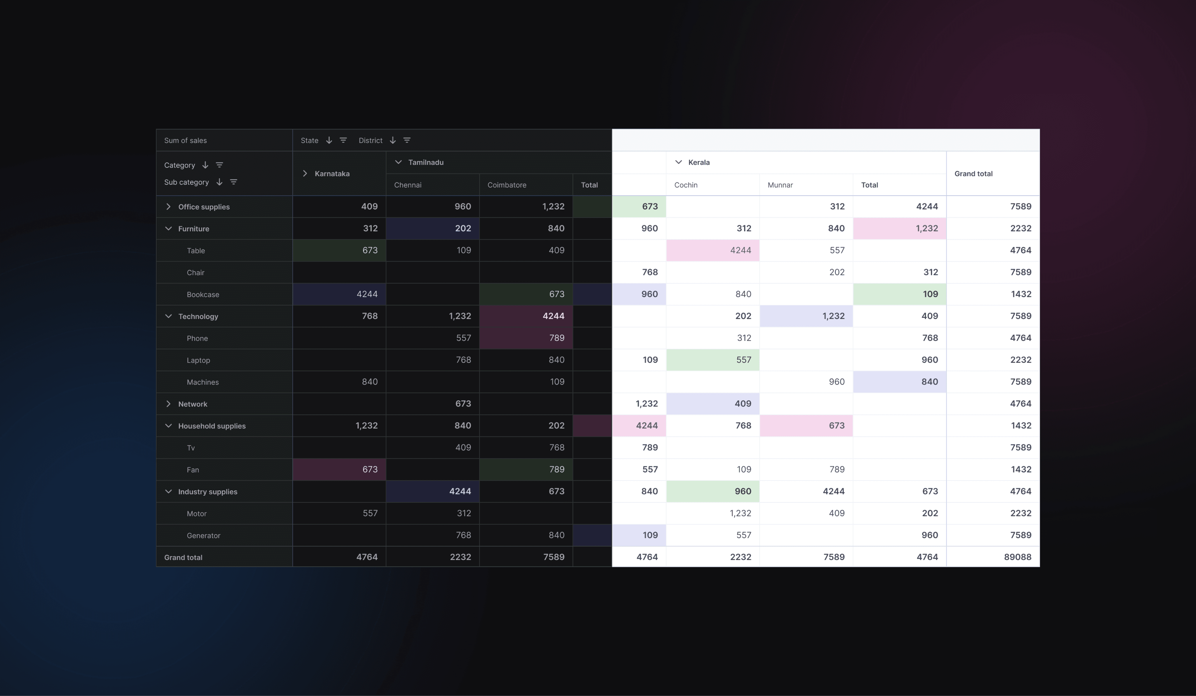
Cleaner, More Readable Interface
Redesigned Pivot Table
To make data exploration effortless, we focused on improving the table’s readability and usability.
Image of New Pivot Table in Light & Dark Mode
Comparison of previous and improved pivot
Comparison of Previous vs. Improved Pivot Table
Added Controls for Users
Pivot Table Interactions
Users wanted control over how they interact with data. We added new features that allow them to explore and manipulate reports effortlessly.
Video Showing All New Controls & Interactions
Video
Impact
Let's talk impact
This project started with a drop-off problem—users abandoned pivot table creation midway due to confusion, a lack of guidance, and poor usability. But now
Users can complete the pivot creation process without hesitation.
More users are building pivot reports inside Kissflow instead of exporting to Excel or Power BI.
The average time to build a pivot dropped from 5+ minutes to under 3 minutes.
